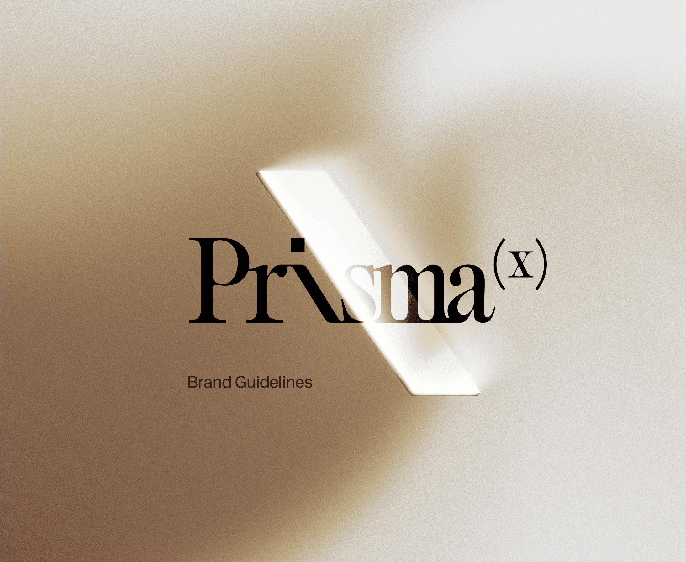
Brand Kit . Logos, Colors, and Visual Guidelines
This kit provides the core visual guidelines and assets to keep our brand consistent and recognizable. Inside you’ll find our colors, typography, logo usage, icons, and motion rules. All designed to reflect PrismaX’s focus on clarity, precision, and innovation. Use these elements to create materials that align with our identity and strengthen how we present PrismaX across every channel.
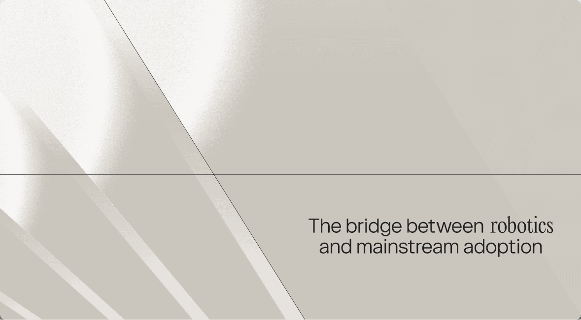
Brand statement
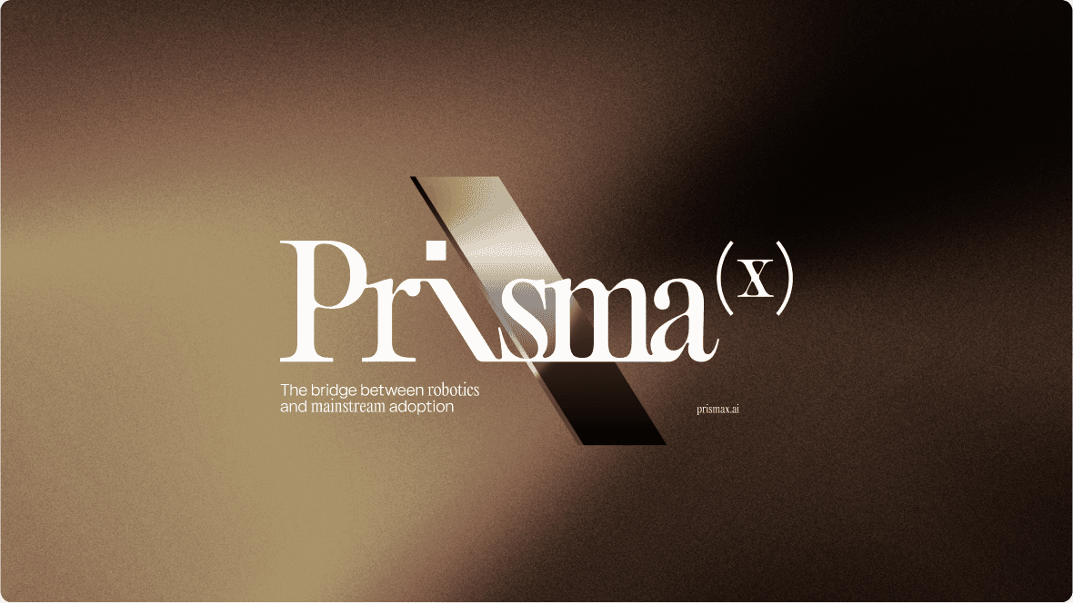
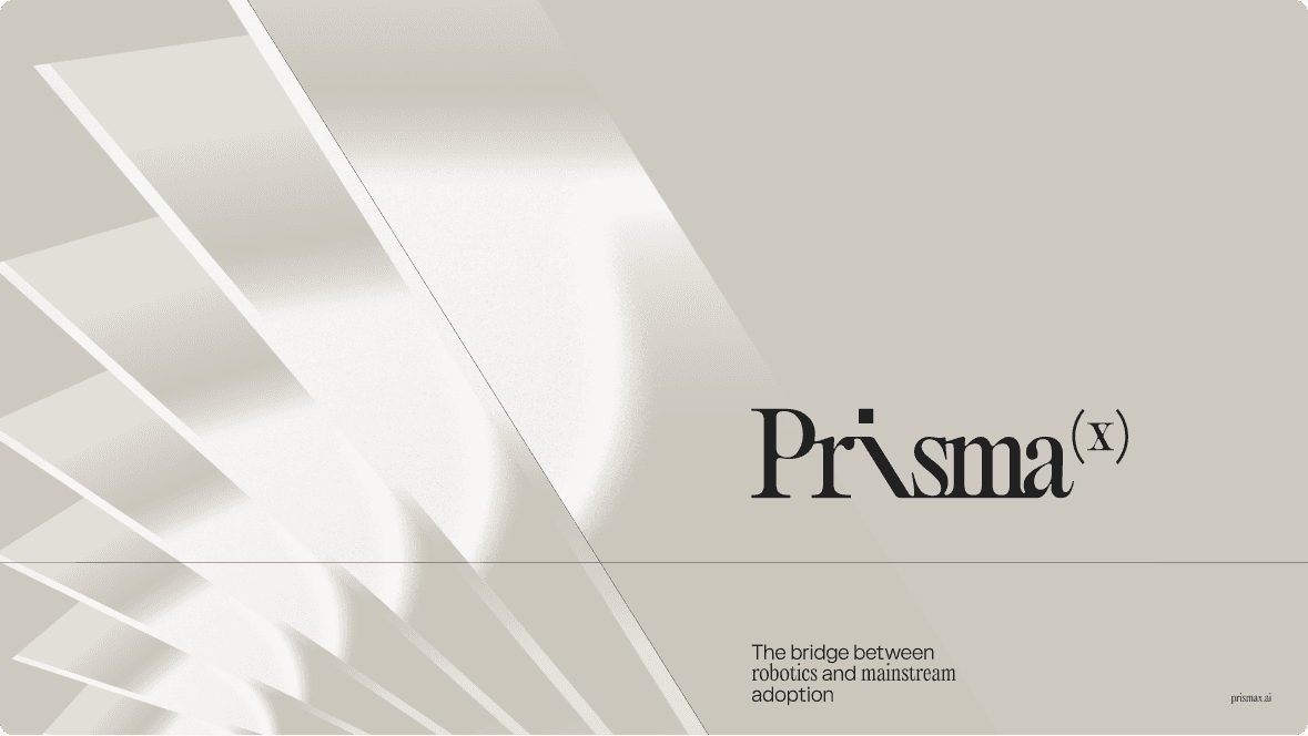
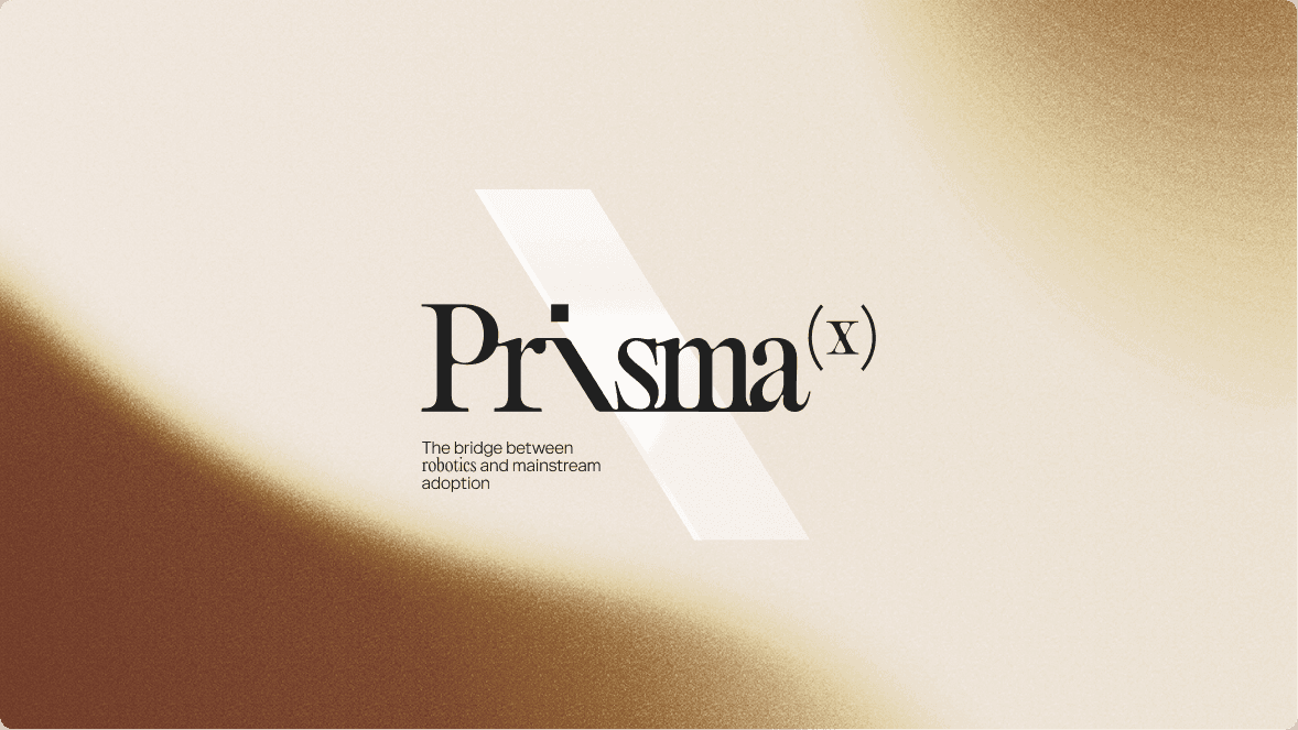
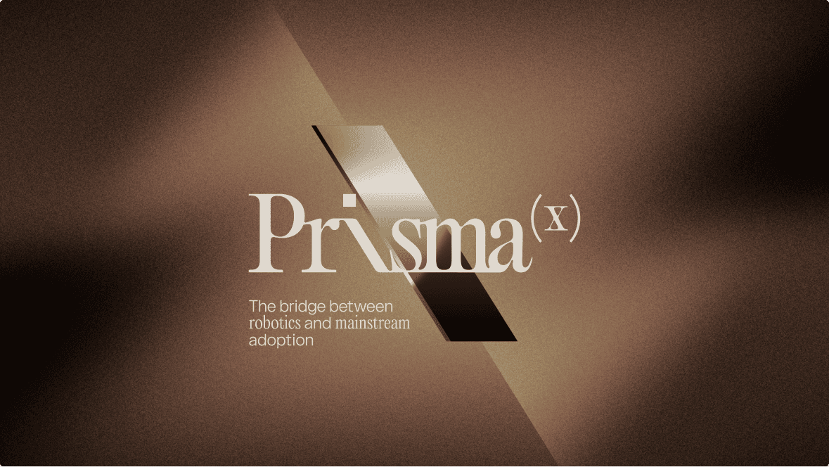
The bridge between robotics and mainstream adoption.
Brand claim
Operate robots. Generate data. Train better AI.
Logo
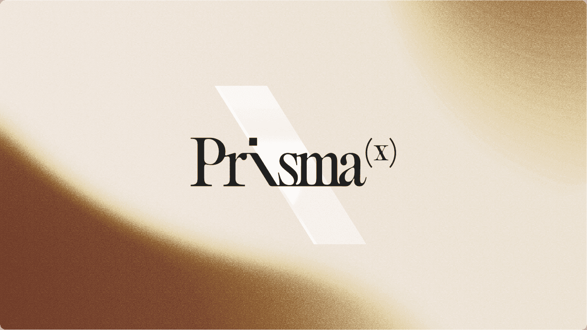
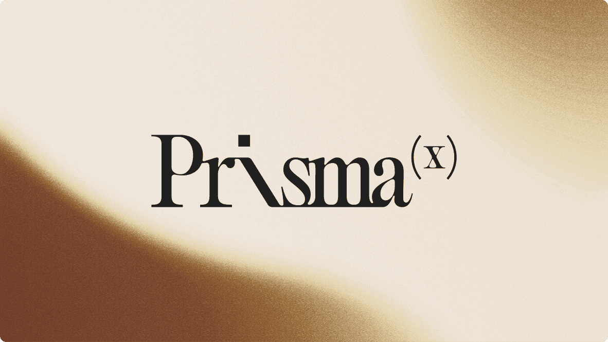
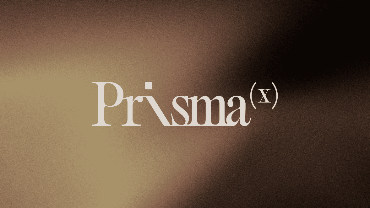
The PrismaX logo is the visual starting point of the brand — a fusion of editorial elegance and technological precision. The composition of refined serifs and minimalist geometry symbolizes the intersection between human perception and algorithmic logic.
Full logotype
Lockups
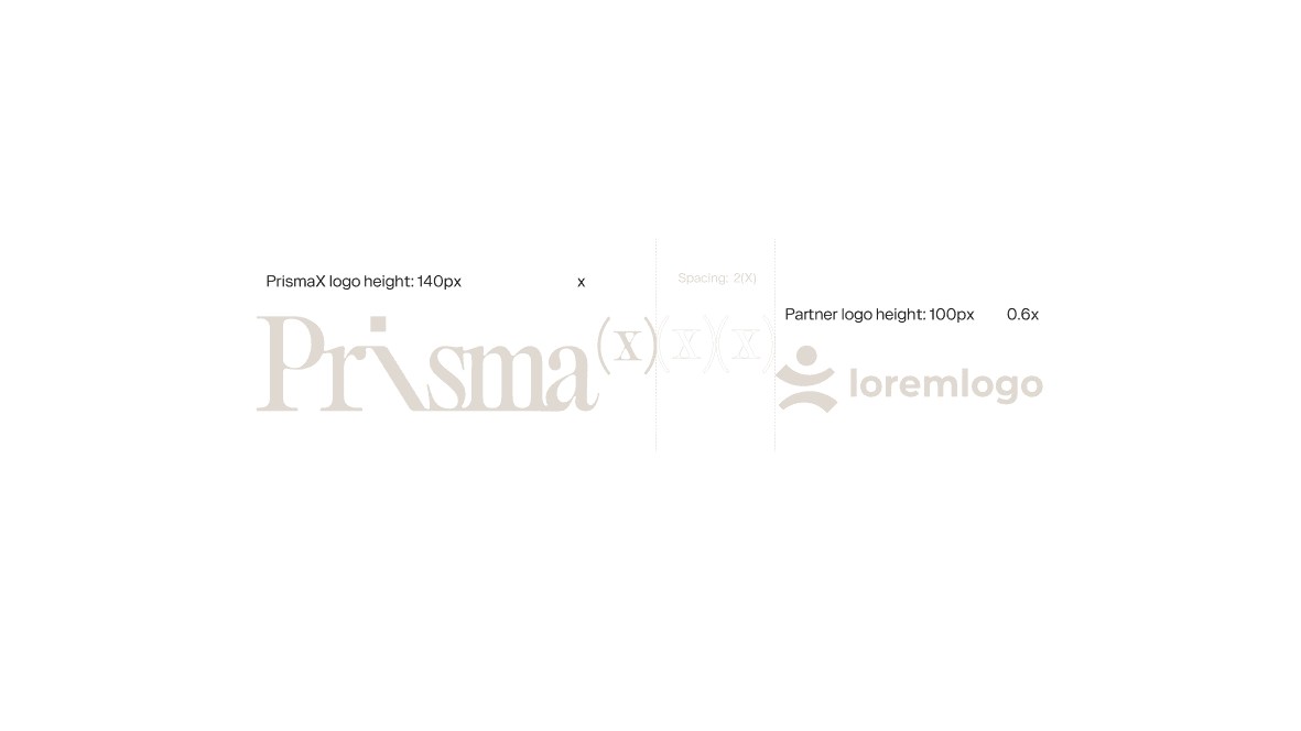
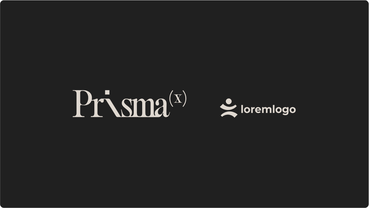
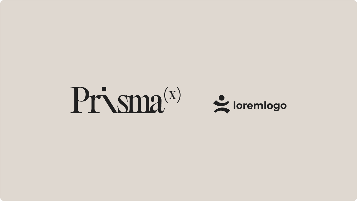
PrismaX logo lockups are designed for diverse use cases — from digital to print and corporate contexts. Each composition preserves visual integrity, clarity, and impact, ensuring brand consistency across touchpoints.

Logo lockup A

Logo lockup B

Logo lockup C
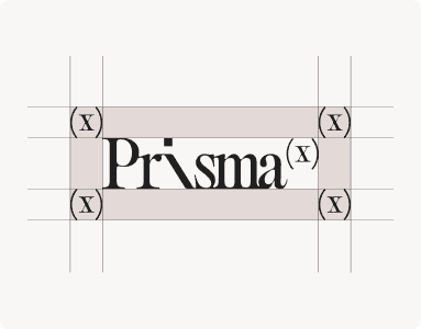
Usage
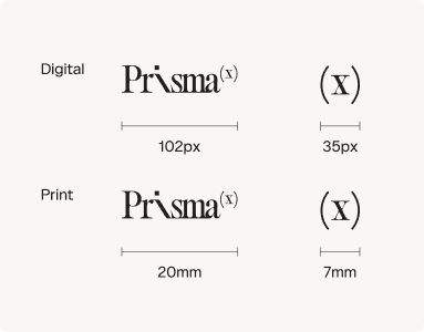
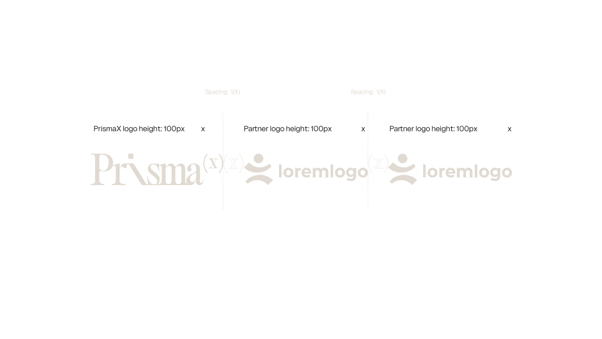
The protection zone is defined by the size of the (X) element of the logo, applied equally on all sides.
Minimum sizes for digital and print are different. See the table below.
Download
Various formats for digital and print
These examples show the brand in action, illustrating how typography, color, and layout come together across different applications. They serve as inspiration and guidance for maintaining consistency while allowing creative flexibility.
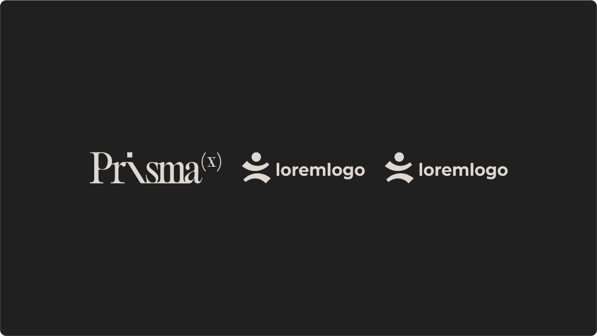
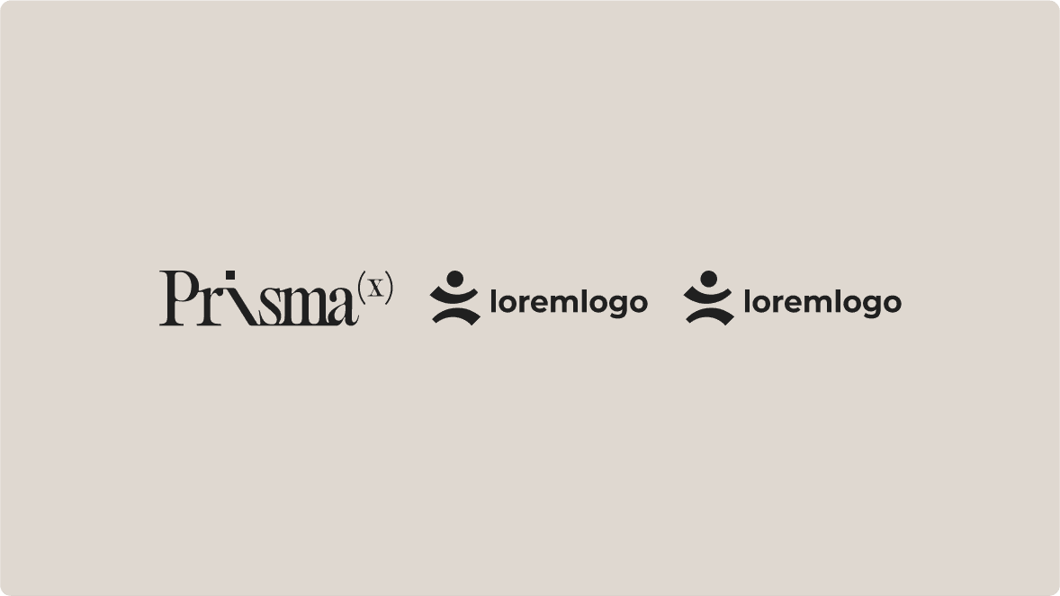
One partner
16x9 / 1920x1080px
Two partners
16x9 / 1920x1080px
Colors
PrismaX’s color palette balances the tangible with the abstract: neutral tones like black and cream evoke elegance and clarity. These chromatic codes serve as the foundation for refined and contemporary brand applications.
Primary Pallete
Black
#202020
Cream
#DFD8D0
White
#FFFFFF
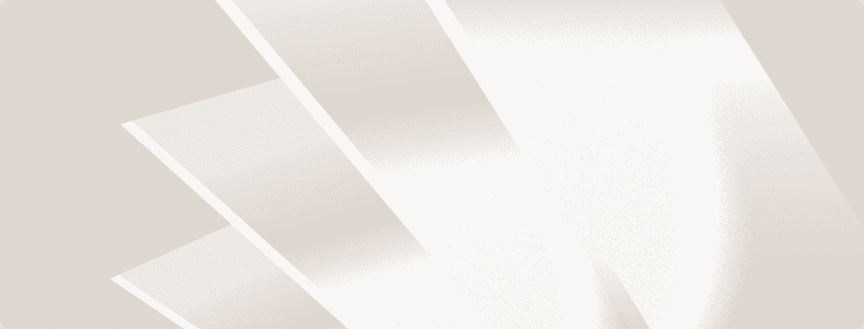
Textures
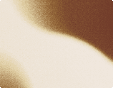
Fluid textures
Fluid textures bring sensory depth to the brand identity. Inspired by optical and physical phenomena, they create dynamic surfaces that shift with context — suggesting movement, transformation, and adaptability.

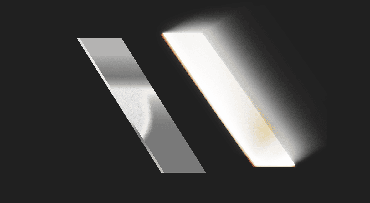
Glass textures
Glass-like textures convey transparency and dimensionality. They reflect PrismaX’s ambition to reveal complexity with clarity, offering intuitive interfaces for sophisticated systems.
Color application
The brand must be applied exclusively in black or white. These versions ensure optimal contrast and maintain visual clarity across both light and dark backgrounds. Important: Any application of the brand in colors other than black or white is incorrect and compromises the integrity of the visual identity.
Download
Download the full texture pack here.
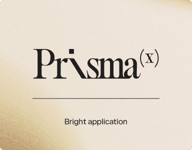
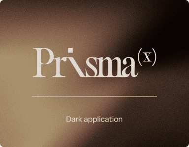
Typography
Typography is a central pillar of the brand’s identity, relying on well-balanced and confident type to ensure clarity, authority, and consistency. The primary typeface, Catalogue, communicates strength, rationality, and versatility through precise letterforms and balanced proportions that express technological efficiency with editorial sophistication. The secondary typeface, Editorial, provides refined contrast, used in headings or emphasis to create tension and balance with the primary font — reinforcing the brand’s human-machine duality.
Primary
Catalogue is a strong & versatile sans-serif
Secondary
Editorial is an elegant serif to represent technology.
Typography pairing
The pairing of logo and tagline must respect alignment and spacing to preserve visual hierarchy and harmony. This union expresses PrismaX’s commitment to clarity, purpose, and precision.
Graphics
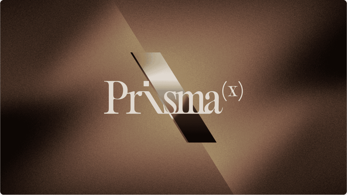
Mirror
The mirror graphic element embodies PrismaX’s conceptual essence — revealing hidden layers, duplicating intelligences, and projecting future potential. It is a visual metaphor for the brand’s hybrid vision.
Illustrations
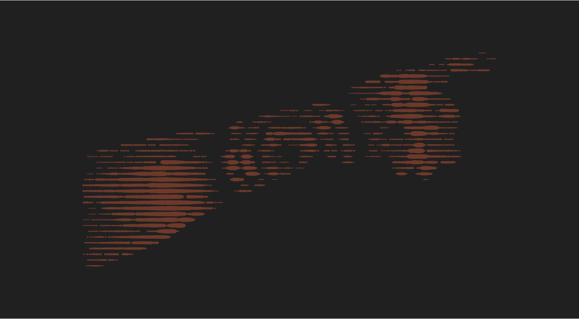
The PrismaX illustration style is defined by precise, modular linework. Each stroke is intentional — clean, sharp, and restrained — reflecting a logic of control and synthesis.
The compositions avoid excess and favor abstraction, using geometry, repetition, and spatial rhythm to build visual narratives. This stylistic approach conveys the brand’s technical rigor and its pursuit of elegant systems.
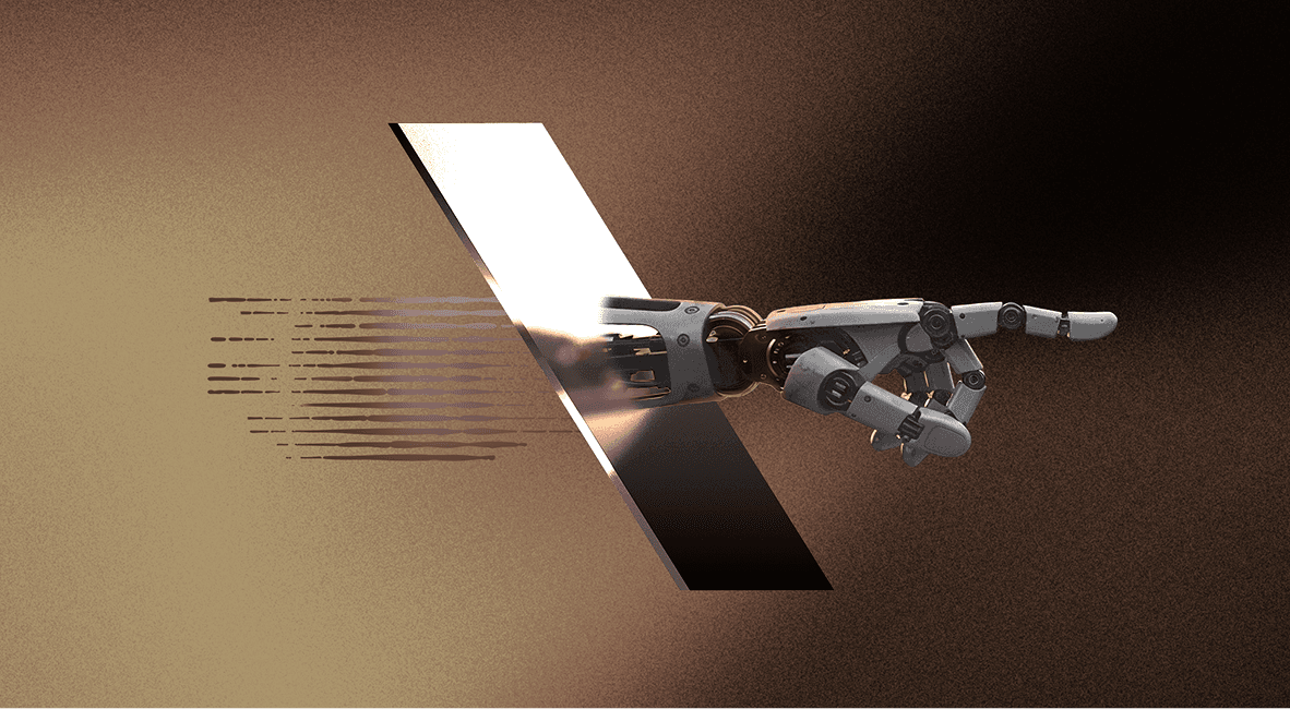
KV Construction
The construction of PrismaX’s key visuals explores the intersection of body, mirror, and data. These compositions create iconic scenes that communicate structure, elegance, and systemic articulation.
Lines and shapes
The brand’s graphic language uses lines and geometric forms to express abstraction and control. Diagonals, overlays, and calculated rhythm add visual tension and technical harmony.
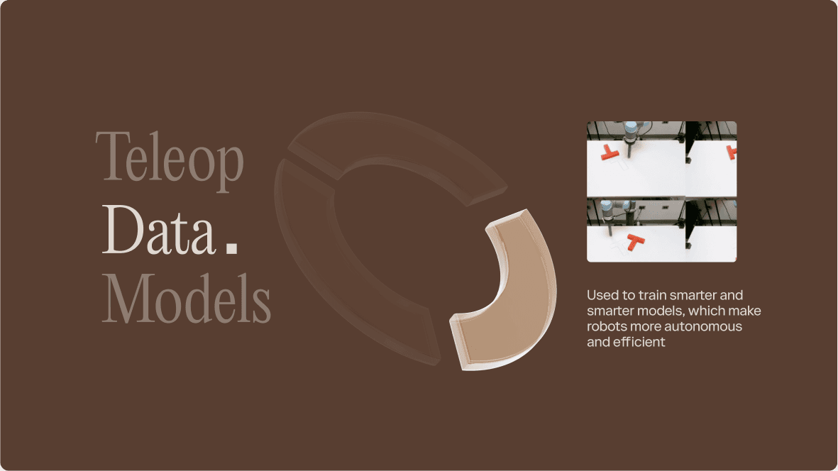
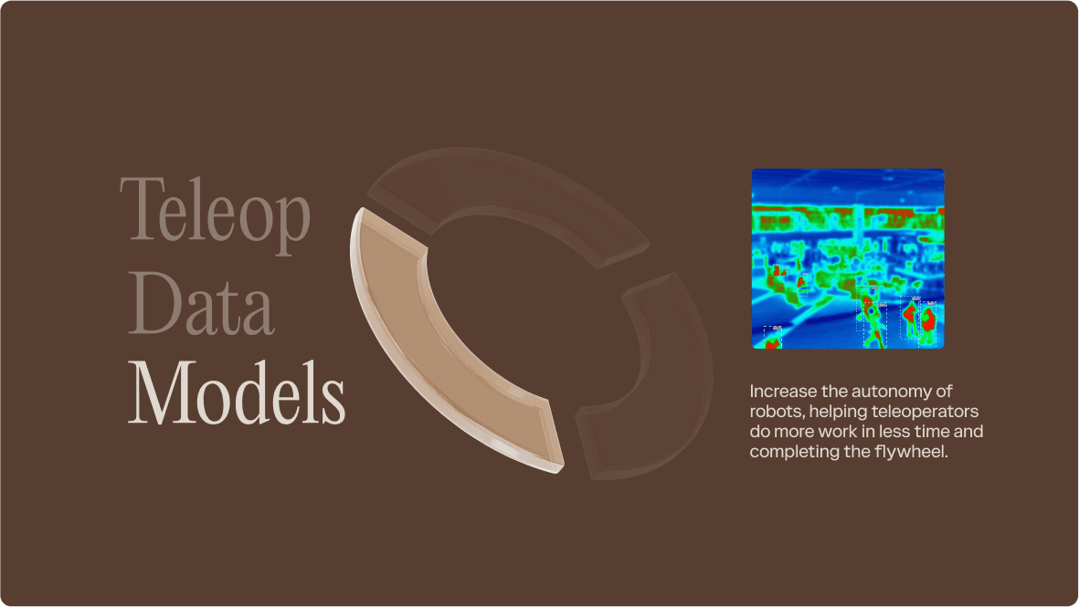
Flywheel
The construction of PrismaX’s key visuals explores the intersection of body, mirror, and data. These compositions create iconic scenes that communicate structure, elegance, and systemic articulation.


Download
Download the full graphics pack here.
Brand in Use
These examples show the brand in action, illustrating how typography, color, and layout come together across different applications. They serve as inspiration and guidance for maintaining consistency while allowing creative flexibility.